Knowing your customer and making life easy for them
A website redesign, mobile optimization, and call-to-action!
In April 2022, Kelly’s Kitchen were preparing for a busy summer in Newport. The award winning cafe sees hundreds of tourists every day in the summer as they pass through the heart of the Greenway. The website had not been updated for a couple of years. The images on the site were outdated, the menu had changed, and the site wasn’t optimized for a mobile phone.
In 3 weeks, the site was redesigned, optimized, updated, and ready for the summer season! Read how below:
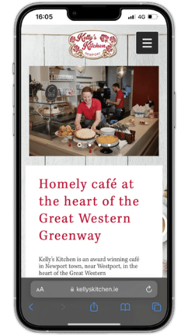
The previous website
To understand how visitors used the website, we checked the website analytics – we learned:
📱 >90% of visitors were using their mobile
However, the website was not completely optimized for mobile. Visitors had to scroll to find the menu. The ‘burger’ menu and colour scheme was not consistent across the website.
So, there were 3 key website design changes to make:
1. Make the website mobile-friendly
2. Make it easy to get to the menus
3. Update the colours and backgrounds for a consistent brand
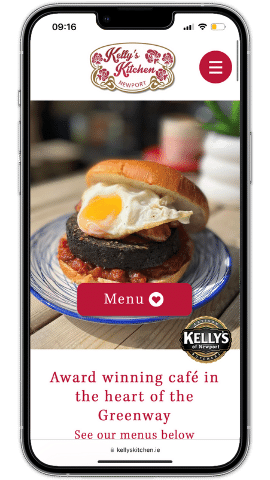
The New Website
Mobile optimised website
The new website design focused on simplicity. The background was removed, in favour of the white background. The beautiful red colour is not used across the website for buttons and menus, to maintain brand consistency.
The first thing you see now is the delicious food in a slide show at the top of the page. Then is a button linking to the menus.
Always use a clear call-to-action!
A call-to-action (CTA) encourages visitors to carry out an action. In this case, it is to view the menu.
As you navigate the website, the spacing is now optimised for mobile. The images have been updated, including the desserts and deli fridge menu.
What our client had to say!
I could not recommend Cathal enough. Cathal revamped our website and helped make it more user friendly. He also came in a day and took the pictures himself for the website. Cathal's personal approach and efficiency made working with him so easy.